Location: Godella, Spain
Photography: Fernando Alda
Two strategies were used to give this house a sense of spaciousness. One was to leave the center of the site unbuilt in order to create a space with strong interior-exterior connections. This was achieved by making the walls facing this inner courtyard all glass. The second strategy was to bring light into the basement. This was done by taking advantage of the terrain’s slope.
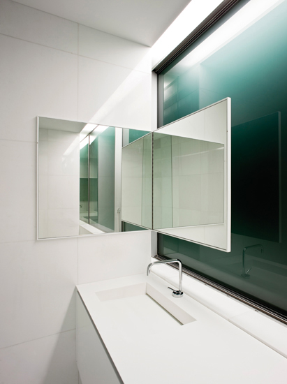
By using a monochromatic color scheme, emphasis is put on form, and light and shadow contrasts are accentuated.
Transparent and opaque surfaces create a dynamic design guided by forms. Long horizontal planes emphasize perspective.
In monochromatic spaces, light can produce serenity, comfort, and intrigue.
Richly colored and textured furnishings are a great accent in all-white spaces. Sparse wood pieces in their natural finishes complement minimalist décor nicely.
The intersection of the house’s two wings is where the staircase, kitchen, and laundry room are, along with the core of the house’s utility spaces.
Small reveals between the floor, walls, and ceilings emphasize planar surfaces over mass. This effect is most visible under artificial lighting.


0 komentar:
Post a Comment